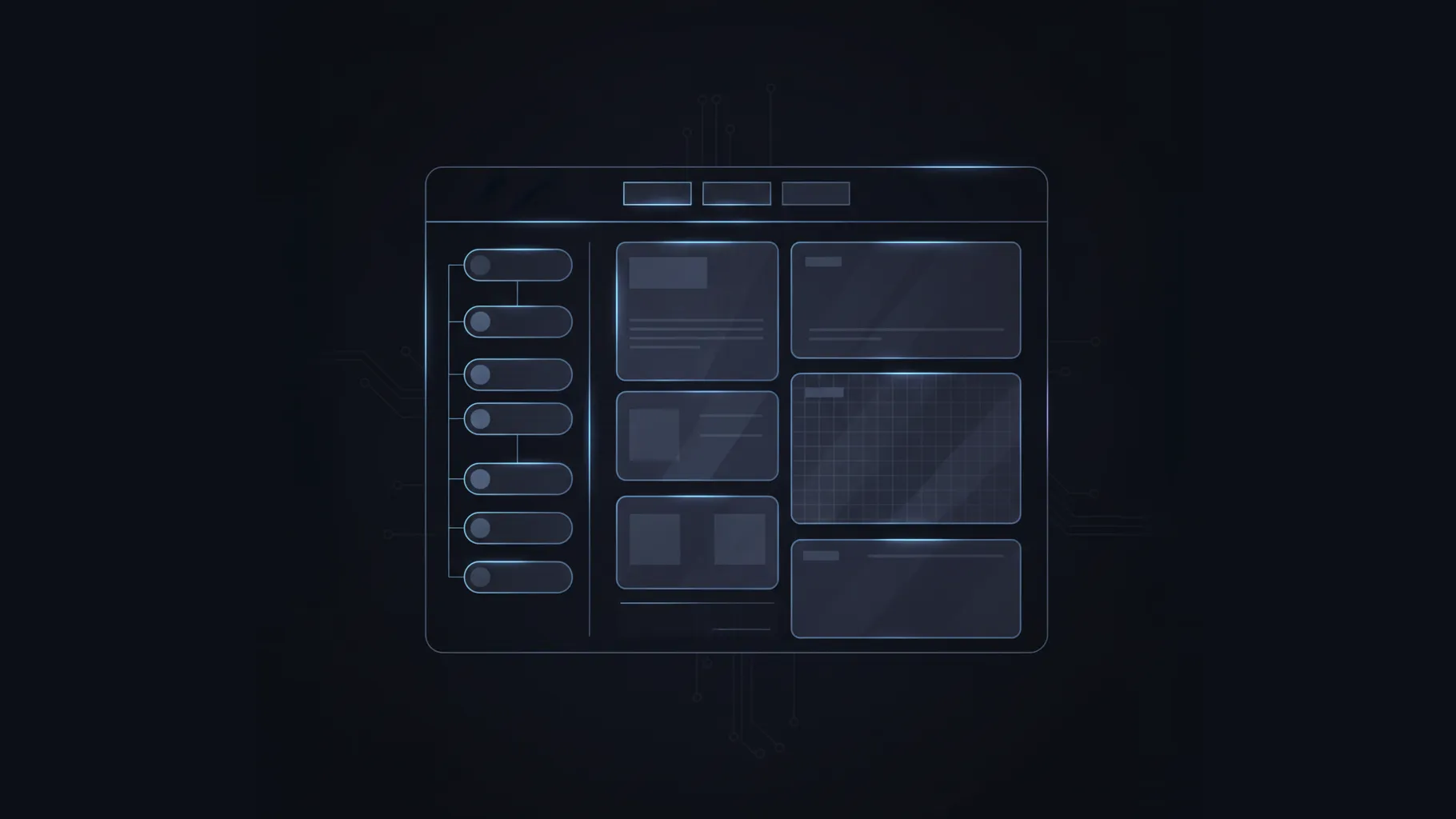
When I started building my own documentation website, one thing became obvious very quickly: the navigation is the backbone of the entire experience. It is the first thing people see, it constantly guides them from page to page, and it defines how readable the whole system feels. A documentation site can have great content, but if the navigation is confusing, everything falls apart.
So I wanted to design a navigation engine that gives me flexibility without drowning me in config files, and still works out of the box if I put zero effort into configuration. That became the foundation of the system I now use.
This post is basically the story of how it came together, what decisions were made, and how the structure finally settled into something simple and powerful.
The Core Idea
I started by asking a simple question: what exactly is a navigation item? At the smallest level, it’s just a page. A slug and a label. That’s it. Nothing more complicated.
From there, everything else is basically structure around these pages. A group is simply a folder. A tab is just a group promoted to the top bar. Icons are optional. Hidden entries are optional. The filesystem does most of the heavy lifting, and configuration steps in only when I want to override something.
The moment I accepted that simplicity, the entire system became much clearer.
Entries, Groups, and the Sidebar
The building blocks look like this:
- Entry: a real page with a slug and a label.
- Group: a collapsible container for entries and other groups. It is not a page.
- Sidebar: a list of top-level groups.
A group can map directly to a folder in the docs directory, or I can point it at any specific folder path if I want to reorganize things without touching the actual directory layout. That gives me a nice way to structure content logically rather than physically.
Groups can nest inside groups. There is no limit to depth. But in practice, most documentation stays within two or three levels.
Tabs: Groups With a Special Flag
At some point, I realized that tabs are nothing magical. They are just groups that sit at the top of the screen instead of inside the sidebar.
So instead of designing a new type of “tab”, I simply added a boolean flag to any group:
tab: trueThis promotes that group to a tab. Its entries and subgroups become the sidebar for that tab. Everything not promoted to a tab automatically lands in the default tab.
This already gives a lot of flexibility. I can have no tabs. Or one. Or ten. The system simply adapts.
The Default Tab
One small detail that took some time to settle was deciding what to do with everything that does not belong to a promoted tab. The answer was simple: everything that is not explicitly a tab belongs to the default tab. Internally, this tab always exists.
But here is the catch. I do not want to show it unless it is needed. So I decided:
- If the default tab is the only tab, then the tab bar does not appear.
- If there are two or more visible tabs (including the default), the tab bar appears.
- If everything on the site has been consumed by explicit tabs and the default is empty, we do not show the default tab at all.
This gave me the cleanest possible UI, with no unnecessary labels.
Strict vs Lenient Navigation
Another interesting challenge was deciding how much control the configuration should have over the navigation.
There are two schools of thought here.
- Strict mode: If a file is not listed in the config, it does not appear.
- Lenient mode: If a file is not listed in the config, automatically add it.
Both approaches have valid use cases. But I did not want to pick only one. So I introduced a per-group flag:
autoGenerated: true | falseIf autoGenerated is true (the default), then configuration only affects ordering. Any file I did not list still shows up alphabetically.
If autoGenerated is false, then only what I list in the config appears. Everything else is ignored. This is perfect for curated sections.
This hybrid model makes the system powerful without forcing me into a rigid pattern.
Hidden Pages
Sometimes I want a page to exist but not show up in navigation. It might be a draft, or an internal reference. So I added a simple flag:
hidden: trueIf a page has this flag, it disappears completely from navigation, no matter what other rules apply. This works in both strict and lenient modes.
A Small Example
Here is a simplified version of how the config might look:
{
  groups: [
    {
      id: "components",
      label: "Components",
      icon: "puzzle",
      tab: true,
      autoGenerated: true,
      entries: [
        { slug: "components/button" }
      ],
      groups: [
        {
          id: "components/form",
          label: "Form Controls",
          path: "components/form",
          entries: [
            { slug: "components/form/validation" }
          ]
        }
      ]
    },
    {
      id: "guides",
      label: "Guides",
      autoGenerated: true,
      entries: [
        { slug: "guides/usage" }
      ],
      groups: [
        {
          id: "guides/advanced",
          label: "Advanced Topics",
          entries: [
            { slug: "guides/advanced/patterns" },
            { slug: "guides/advanced/anti-patterns", hidden: true }
          ]
        }
      ]
    }
  ]
}
Even without understanding the full system, you can read this and immediately see the structure. That was one of my goals: the configuration should be intuitive enough that you can glance at it and know what is happening.
What I Learned From Designing This
A few insights emerged while building this navigation system:
- The filesystem should always be the foundation. Configuration should adjust, not replace.
- Tabs are simpler than they appear. They are just groups that moved up a level.
- The default tab solves a lot of UI problems quietly.
- Strict and lenient behavior both matter, but they should be controlled at a group level.
- The system must never hide pages accidentally. Only explicit hidden flags can remove content.
What I ended up with is a navigation engine that is capable enough for complex documentation setups, but still easy to understand and maintain.
Final Thoughts
Designing this navigation system forced me to think about how people actually browse documentation. It is not just about content; it is about orientation. People need to know where they are, what else exists, and how deep things go. When navigation feels natural, the content automatically feels more accessible.
This system lets me build documentation where structure emerges naturally from folders, but can be shaped and refined when needed. It gives me control where I want it, and automation everywhere else. And honestly, that balance is exactly what I wanted from the start.
If you are working on your own documentation engine or static site generator, I hope this breakdown gives you some ideas on how to think about navigation design. It is one of those things that seems simple at first, but once you get into it, the details become surprisingly interesting.